How a modern website design builds trust

A website serves as the online face of a business, and a well-designed one can help build trust with potential customers. But what exactly makes a website design modern? And how does it impact trust?
A modern website design is characterized by clean aesthetics, user-friendly navigation, and fast loading speeds. It incorporates the latest design trends and technologies to create a seamless user experience. When visitors land on a website that looks professional and up-to-date, they are more likely to trust the brand behind it.
Think about it – if a website looks outdated or is difficult to navigate, would you trust that the company is reliable and trustworthy? Probably not. On the other hand, a modern website design conveys professionalism and attention to detail, signaling to users that the brand cares about their experience.
Elements of a Modern Website Design
A modern website design encompasses several key elements that contribute to its overall effectiveness in building trust. One of the most important aspects is clean aesthetics. This means using a visually appealing color scheme, high-quality images, and consistent branding throughout the website.
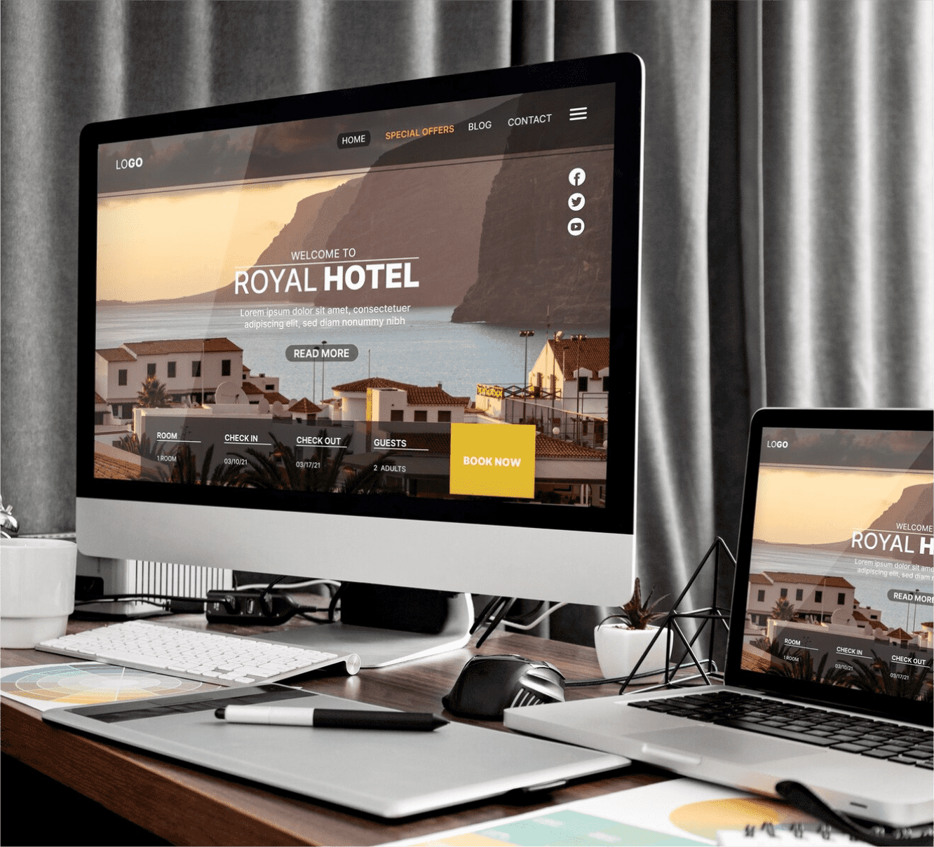
User-friendly navigation is another essential element of a modern website design. When visitors can easily find the information they are looking for, it instills a sense of trust and confidence in the brand.
Fast loading speeds are equally crucial for a modern website design Studies have shown that even a one-second delay in page load time can lead to a significant drop in visitor satisfaction
User Experience and Trustworthiness
User experience (UX) plays a pivotal role in building trust with website visitors. A modern website design prioritizes UX by focusing on intuitive interfaces, easy-to-understand content, and seamless interactions. When users have a positive experience on a website, they are more likely to trust the brand behind it.
 (1)")
A user-friendly website design includes clear and concise copy that effectively communicates the brand’s message. By providing valuable and relevant content, a modern website design establishes the brand as an authority in its industry, further enhancing trust.
Interactive elements, such as chatbots or live chat features, also contribute to a positive user experience. These features allow visitors to ask questions, seek clarification, or receive assistance in real time.
Mobile Responsiveness and Trust
In today’s mobile-centric world, a modern website design must be mobile-responsive. With a significant portion of web traffic coming from mobile devices, it is essential to ensure that a website looks and functions seamlessly across different screen sizes. A mobile-responsive website design signals to users that the brand is technologically up-to-date and cares about their experience. It eliminates the frustration of having to pinch and zoom to view content or navigate through a poorly optimized mobile site. By delivering a smooth and user-friendly experience on any device, a modern website design builds trust and credibility with potential customers.
 (1)")
Visual Aesthetics and Trust
The visual aesthetics of a website play a significant role in shaping visitors’ perception of a brand’s trustworthiness. A modern website design incorporates visually appealing elements, such as high-quality images, videos, and graphics. These elements not only enhance the website’s overall look but also convey professionalism and attention to detail.
Additionally, a modern website design pays attention to the use of whitespace. Whitespace, or negative space, refers to the empty space between elements on a webpage. It allows content to breathe, making it easier to read and navigate. By employing whitespace effectively, a modern website design creates a harmonious and visually appealing layout that enhances user engagement and trust.
Security and Trust
Security is a paramount concern for both website owners and visitors. A modern website design prioritizes security measures to protect user data and instill trust. This includes implementing secure protocols, such as HTTPS, to encrypt data transmission between the website and users’ browsers.
In addition to encryption, a modern website design ensures that all software and plugins used on the website are kept up to date. Regular updates patch security vulnerabilities, reducing the risk of data breaches or unauthorized access.
 (1)")
Loading Speed and Trust
In today’s fast-paced world, speed matters. A modern website design prioritizes fast loading speeds to provide visitors with a seamless browsing experience. Slow-loading websites not only frustrate users but also erode trust in the brand. Visitors may perceive a slow website as outdated or unreliable, leading them to question the brand’s credibility.
To ensure fast loading speeds, a modern website design optimizes images, compresses files, and minimizes the use of external scripts. Caching techniques, such as browser caching and content delivery networks (CDNs), are also employed to reduce server response time and deliver content quickly to users.
 (1)")
The Importance of Website Design in Building Trust
A modern website design is characterized by clean aesthetics, user-friendly navigation, and fast loading speeds. It incorporates the latest design trends and technologies to create a seamless user experience. When visitors land on a website that looks professional and up-to-date, they are more likely to trust the brand behind it.
Firstly, let’s consider the aesthetics. A modern website design typically features a clean and visually appealing layout. This means using a well-chosen color palette, high-quality images, and a balanced use of white space. When a website looks visually appealing, it immediately grabs the attention of users and creates a positive first impression. This positive impression can go a long way in building trust, as users are more likely to perceive a visually appealing website as being credible and reliable.
Additionally, a modern website design goes beyond aesthetics and focuses on user-friendly navigation. A well-organized and intuitive navigation menu allows users to easily find the information they are looking for. This not only enhances the user experience but also signals to users that the brand values their time and effort. If a website is difficult to navigate or lacks clear organization, users may become frustrated and question the credibility of the brand behind it.
Furthermore, fast-loading speeds are crucial in today’s fast-paced digital world. Users expect websites to load quickly, and if a website takes too long to load, they are likely to leave and seek information elsewhere. A modern website design prioritizes fast loading speeds by optimizing images and using efficient coding practices. When a website loads quickly, users are more likely to stay engaged and trust that the brand is technologically competent.
Testimonials and Social Proof
In addition to aesthetics and user-friendly navigation, another important aspect of a modern website design that builds trust is the inclusion of testimonials and social proof. Testimonials are a powerful tool in establishing trust with potential customers.
Firstly, testimonials provide social proof. When potential customers see that others have had a positive experience with a brand, it reassures them that their own experience is likely to be positive as well. Testimonials can be displayed in various ways on a website, such as in a dedicated testimonial section or strategically placed throughout the site. By showcasing the positive experiences of past customers, a website design with testimonials helps to build trust by showing that the brand has a track record of satisfied customers.
Secondly, testimonials add credibility. When potential customers see testimonials from real people who have had positive experiences with a brand, it adds a human element and makes the brand more relatable. This relatability can help potential customers feel more comfortable and trusting towards the brand. The testimonials need to be genuine and authentic, as fake or exaggerated testimonials can have the opposite effect and undermine trust.
Lastly, a modern website design can also incorporate other forms of social proof, such as displaying the number of satisfied customers or highlighting any industry awards or certifications. These elements further reinforce the credibility and trustworthiness of the brand. When potential customers see that others have had positive experiences or that the brand has been recognized for its quality, they are more likely to trust the brand and feel confident in their decision to engage with it.
 (1)")
Conclusion
In conclusion, a modern website design plays a crucial role in building trust with potential customers. It conveys professionalism, attention to detail, and a commitment to providing a positive user experience. Aesthetics, user-friendly navigation, fast loading speeds, and the inclusion of testimonials and social proof all contribute to establishing trust and credibility with users.
Investing in a modern website design is not only about creating a visually appealing online presence but also about creating a positive impression and instilling trust in potential customers. In today’s competitive digital landscape, a well-designed website can make all the difference in attracting and retaining customers. So, if you want to establish trust with your audience and maximize your online presence, investing in a modern website design is key.
Just drop an email at hello@techtix.co to contact the specialists in our team and get started with a full fledged professional website for your business in very economical packages!